FONT:
Forma DJR Deck
Software:
Adobe Illustrator, Adobe Photoshop
What is Taacha?
Taacha is a Chocolate Company. "Taacha" translates literally into "key" in Nepal Bhasa, a Tibetan-Burman language spoken in Nepal. It symbolizes the key to friendship, the key to family, and the key to good relationships—a perfect representation for chocolates to commemorate those sweet moments in life with loved ones.
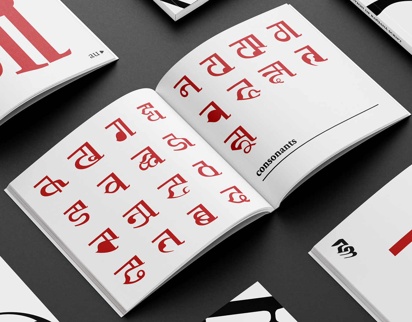
The background features the deconstructed Ranjana Script, a writing system of Nepal Bhasa, which is classified as endangered by UNESCO. This pays homage to the written language that has waned in usage in recent years due to the changing political landscape in the country.
In recent years, the alphabet has gained popularity among young people as an effort to preserve the language. Consequently, this brand is primarily targeted towards culturally conscious Nepali youngsters while welcoming people of all ages, because who doesn't love chocolates anyway?
Exploring logo IDEAs:
I had a pre-thought out idea of a deconstructed background for the shopping bag design, hence I wanted to keep the logo simple but modern.
Final logo:
Design process for the background:
Step 1
For the background, I wrote Taacha in Ranjana Script through Photoshop. Some elements in the alphabet had to be altered for design purposes. The correct way of writing is referenced in the *picture.
I used illustrator to make grid on top of the word. I adjusted the number and size of each boxes so that it would contain interesting shapes within.
*Original way to write Taacha in Ranjana Script
Step 2
After moving around the cut pieces, I concluded with the following design. I was looking at the interaction of the shapes in each design and the flow of the white space from one box to the other.
The deconstruction of the alphabet
Step 3:
The logo was overlaid on top of the gridded deconstructed typeface to create the design for the shopping bag. Below are the various versions of the design.
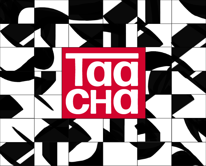
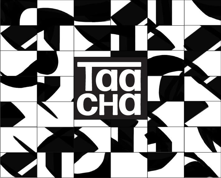
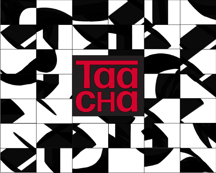
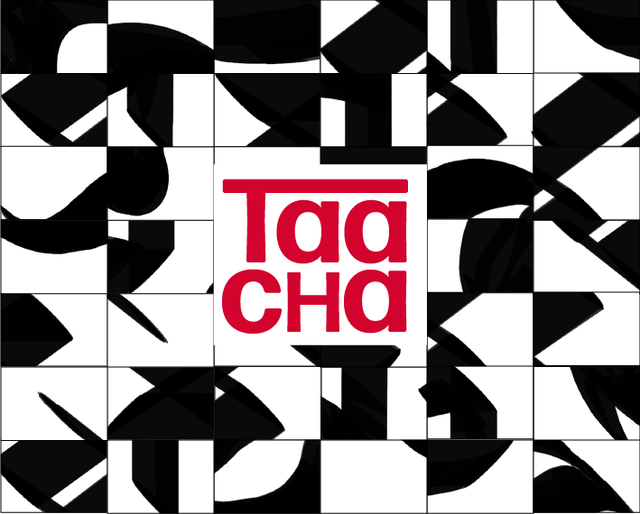
The first design had a higher legibility and worked better with the design through the color choice.
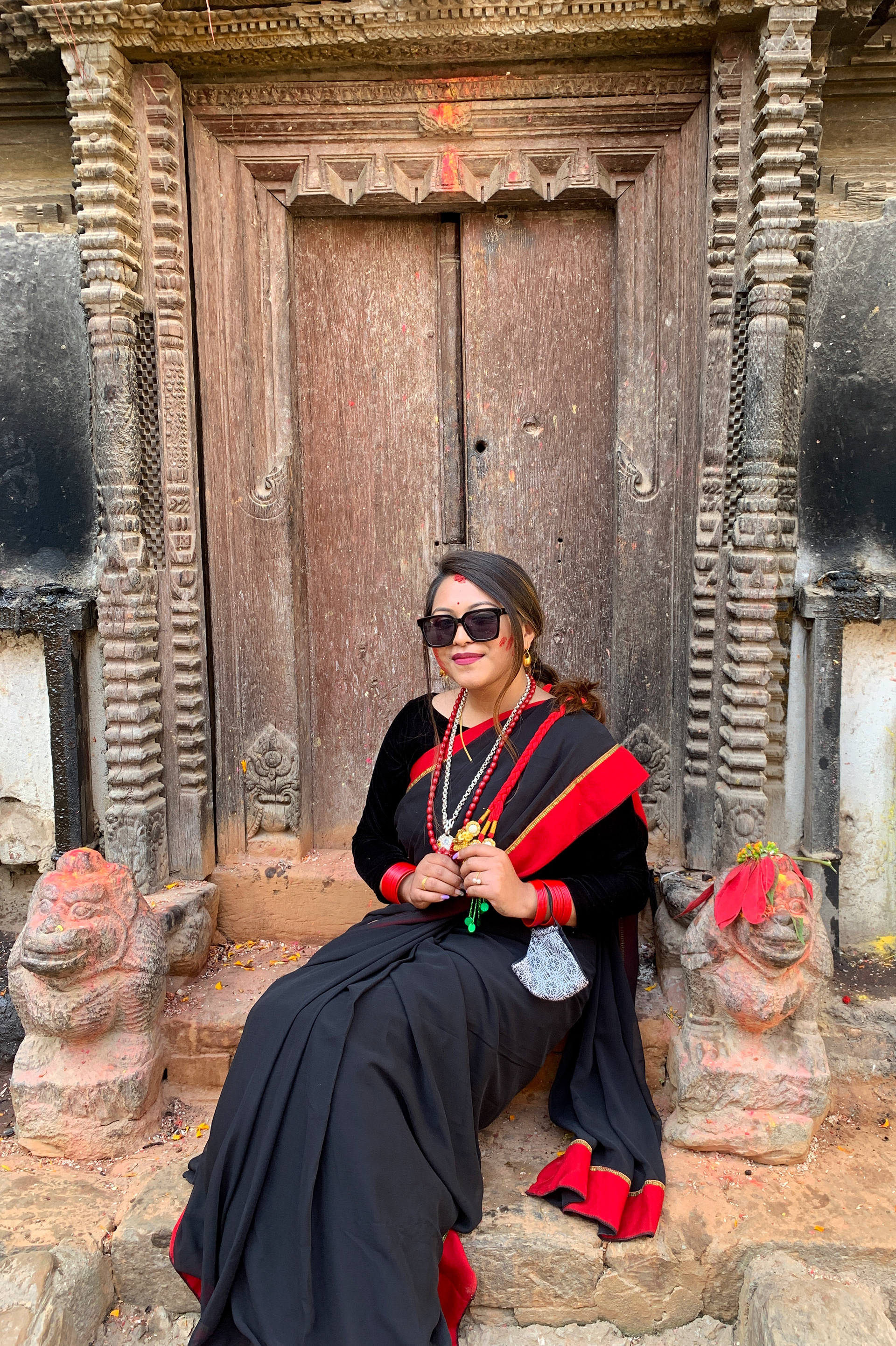
COlor choice:
Here are images of my friend in traditional newari garb. The color choices were inspired by the traditional attire of the culture.

Step 4 / Final Design:
Inspiration:
I was inspired by the identity and packaging design for Saks Fifth Avenue by Michael Bierut for this project.


