1922, Stephen King
concept:
Versions:
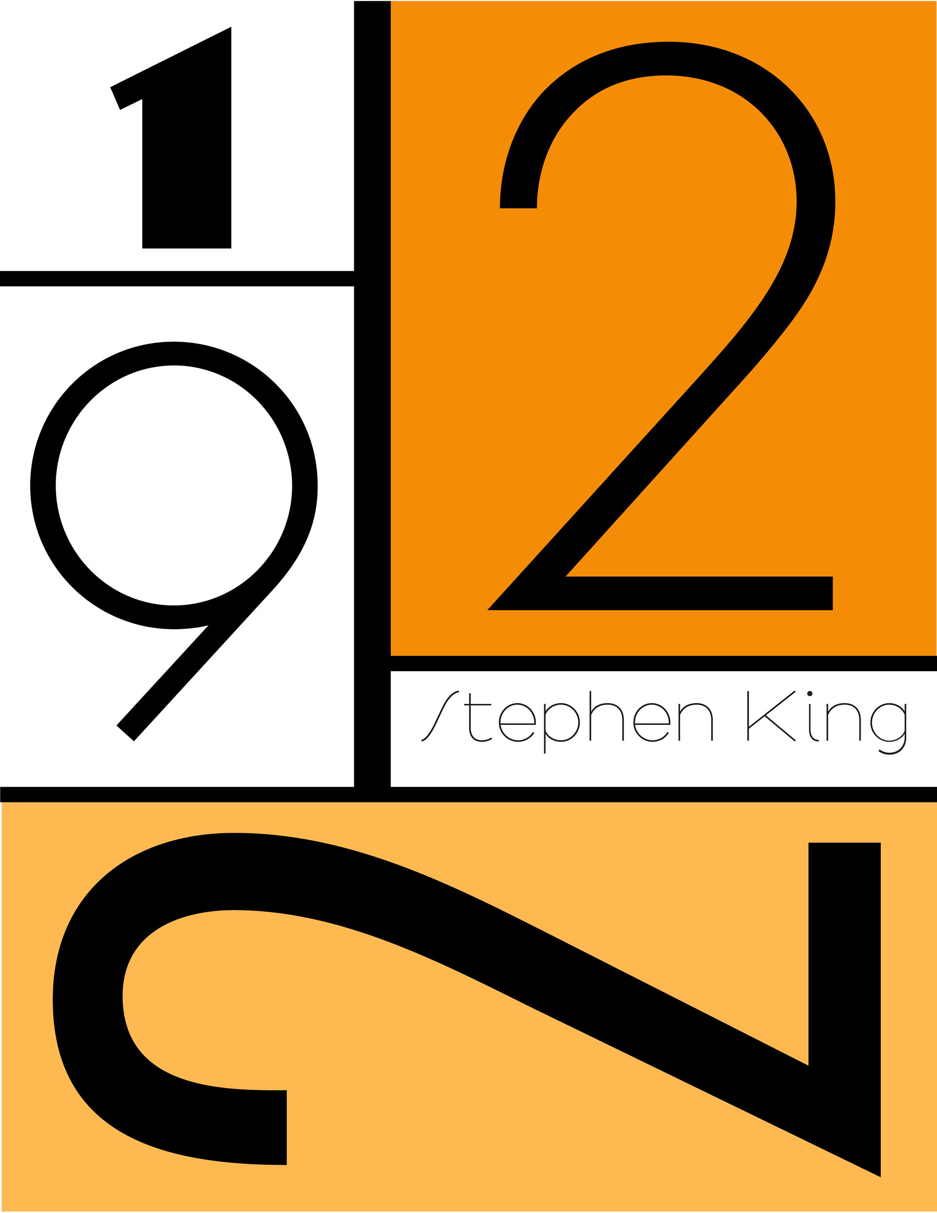
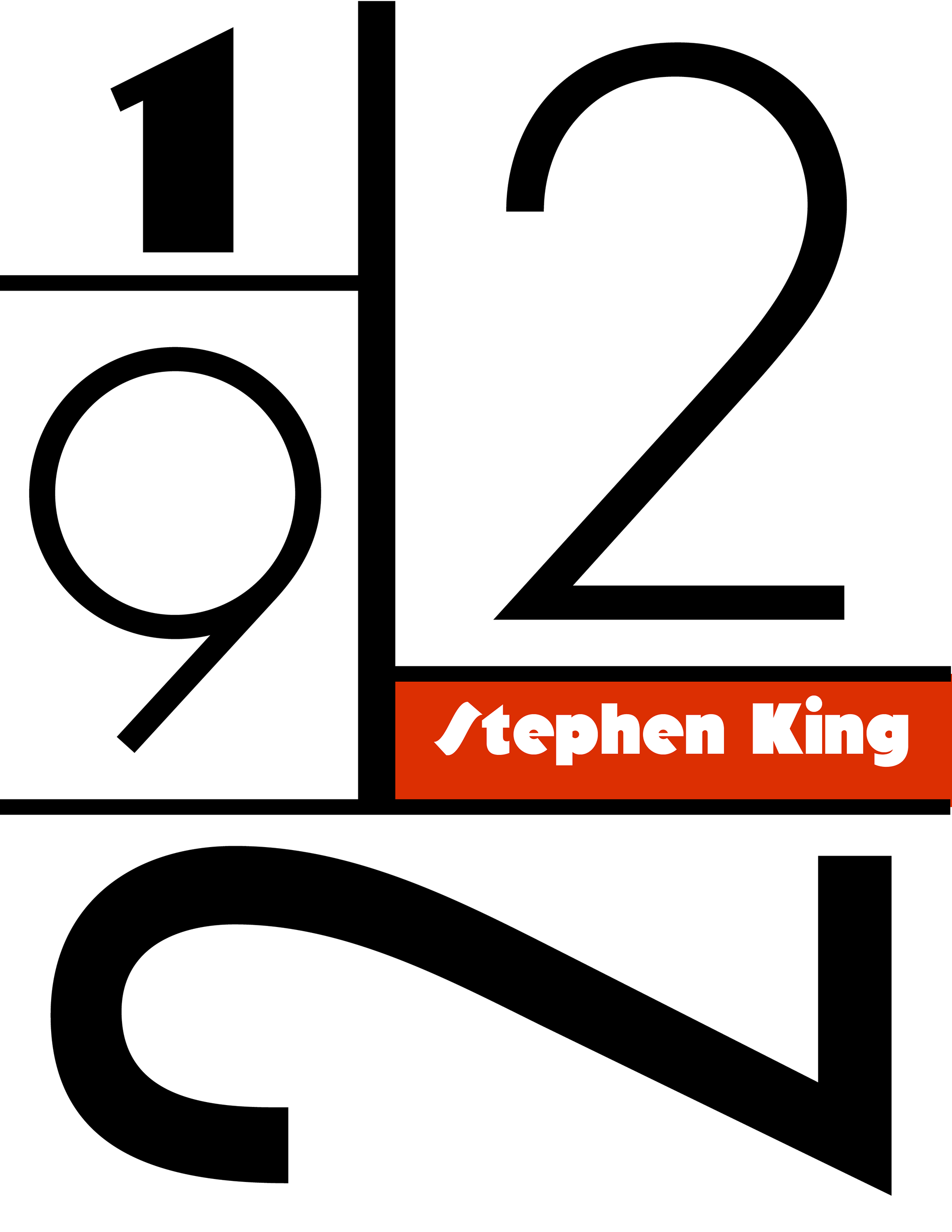

I went with the third design cause the S in the 1st and 2nd design looked out of place. The colors in the third design stood out the most. I did some additional change in hue of green in the final design. I had to play with the sizes of the box compared to the initial concept to better fit the numbers. The author' s name was changed to all caps as the ascender and descender of the type was disturbing the negative space around the name. The vertical lines are thicker compared to the thinner horizontal line to maintain balance with the weight of the numbers.
Inspiration:
I took inspiration from the the geometric shapes and the thick black strokes of the destijl movement. I used the san serif font to keep up the overall theme of simplicity.
Contra-Composition of Dissonances, XVI, Theo van Doesburg
Font Selection Process:
Numbers were picked out in different weight from font families of Futura and Arbotek that complement the overall design .
Final Result:
