MoMA Onsite Search

A search that starts with inspiration and ends with an itinerary.

A search that starts with inspiration and ends with an itinerary.

Product Design

Product Design

Product Design

Mobile App

Mobile App

Mobile App

UX Research

UX Research

ROLE

ROLE

Product Designer, UX Researcher, Developer

Product Designer, UX Researcher, Developer

TOOL STACK

TOOL STACK

Figma · React, Cursor · Claude Code · Anthropic API · Microsoft Azure API · Vercel

Figma · React, Cursor · Claude Code · Anthropic API · Microsoft Azure API · Vercel

OUTCOME

OUTCOME

Presented at MoMA Digital Product Design & Cross-functional teams

Presented at MoMA Digital Product Design & Cross-functional teams

DURATION

DURATION

5 Months

5 Months

TEAM

TEAM

Solo

Solo

MoMA's digital archive holds 106,000 works, but search wasn't helping people find any of them. I designed for the visitor standing in the galleries, phone in hand, painting nowhere in sight.

MoMA's digital archive holds 106,000 works, but search wasn't helping people find any of them. I designed for the visitor standing in the galleries, phone in hand, painting nowhere in sight.

Problem

Problem

Search breaks for someone standing onsite at MoMA

Half of MoMA's searchers are academic researchers. 15% are planning a visit. But there's a third group the data surfaced and the product ignored: people onsite, phone out, mid-visit, with no title and no plan, just trying to find the art in front of them.

Search returns 735 results: title, medium, archive documents, old exhibitions. What an onsite visitor actually needs (gallery location, on-view status, audio guide) exists, but it's one tap deeper, buried on the artwork page.

How might we help someone move from vague curiosity to a confident plan they can walk?

How might we help someone move from vague curiosity to a confident plan they can walk?

Competitive audit

Competitive audit

Six discovery principles, benchmarked against everyday apps
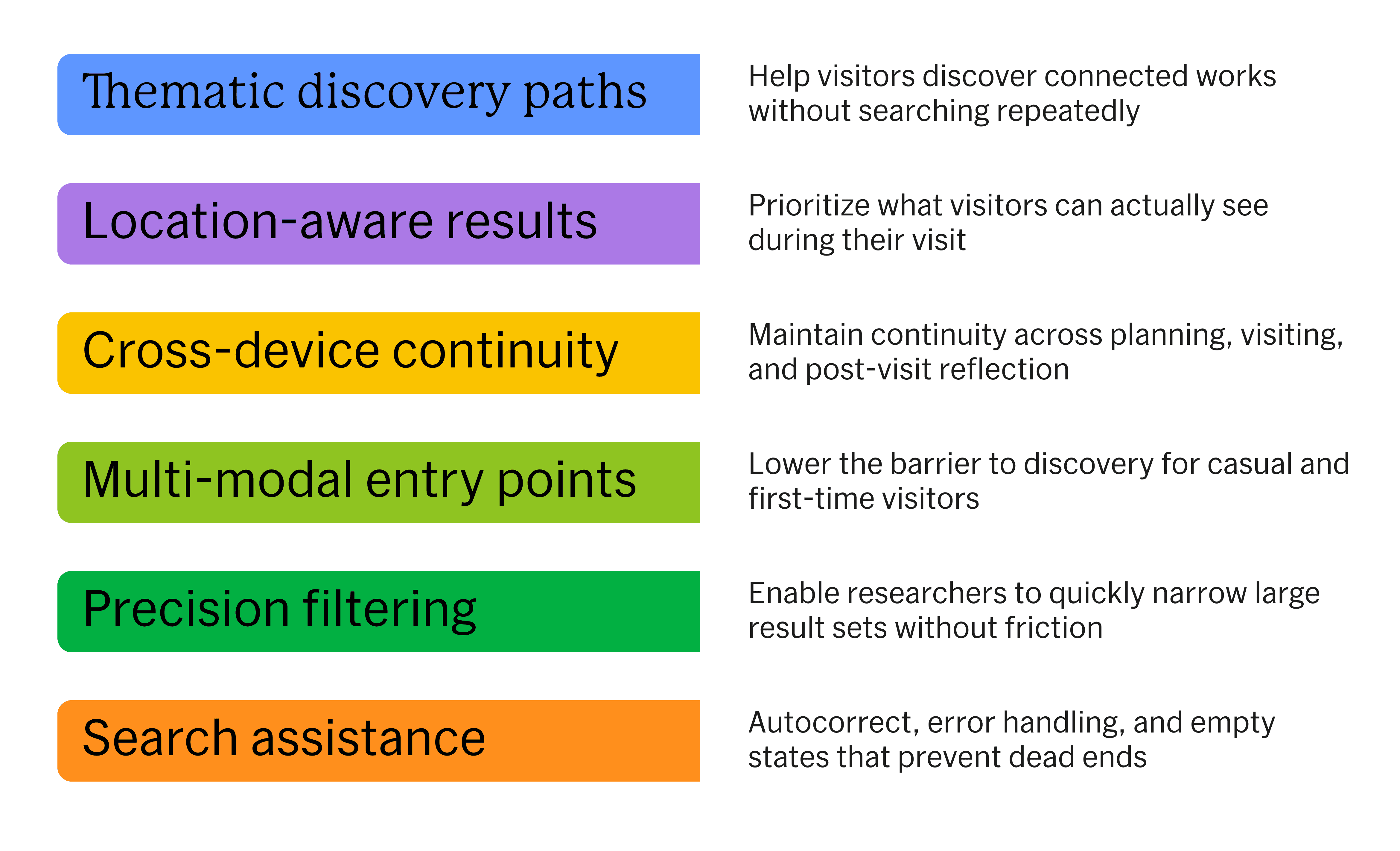
I audited direct museum competitors alongside daily-use platforms: Google, Amazon, Spotify, Pinterest, Netflix. Museums showed me what not to do: built for lookup, not exploration. Consumer platforms showed me what to do.

The best platforms don't show you results.
They help you decide what to do next.

The best platforms don't show you results.
They help you decide what to do next.

The reframe

The reframe

Search isn't a lookup, it's the start of a visit

I stopped treating search as a tool and started treating it as the entry point into learning, planning, and walking the museum. That single shift turned the project into one connected system: a search-to-itinerary experience. Three pillars hold it up.

I stopped treating search as a tool and started treating it as the entry point into learning, planning, and walking the museum. That single shift turned the project into one connected system. A search-to-itinerary experience with three pillars.

Context first state

Context first state

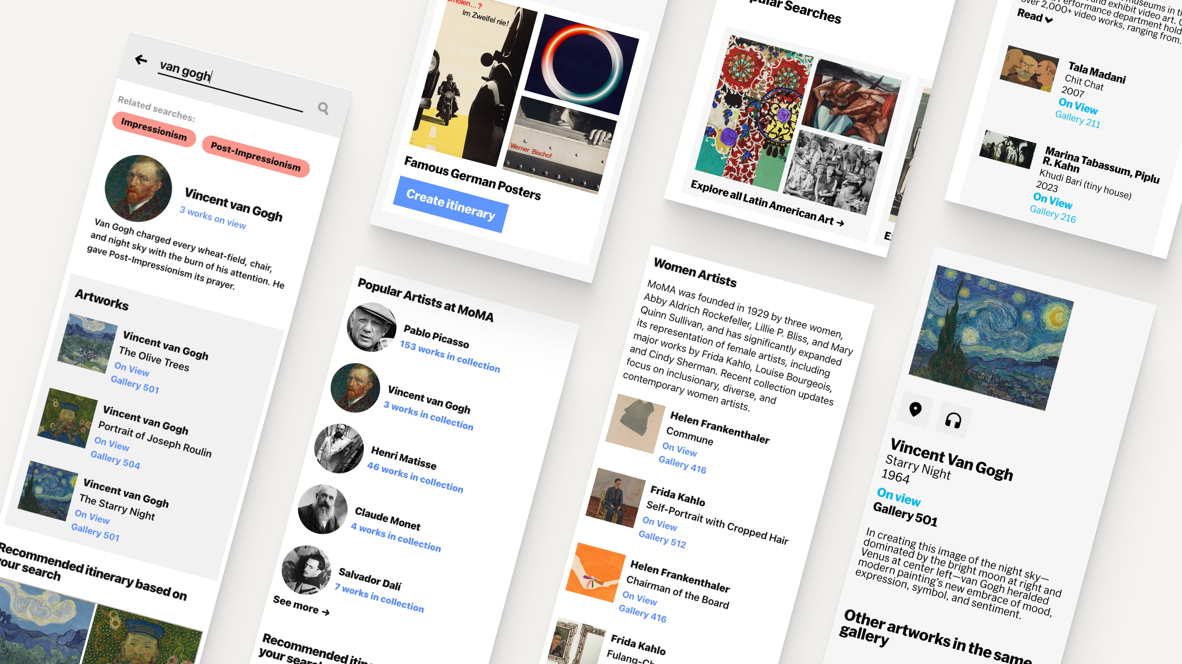
Replaced the empty search bar with thematic collections, popular pills, and ready-made itineraries.

Replaced the empty search bar with thematic collections, popular pills, and ready-made itineraries.

Pages match the query

See what shaped his eye

Page match the query

Artwork, artist, and movement results each get their own layout.

Artwork, artist, and movement results each get their own layout.

Recommended Itinerary

Recommended itinerary

Decide what he started

Each result recommends an itinerary. After building, a banner travels with you, ready for the next checkmark.

Each result recommends an itinerary. After building, a banner travels with you, ready for the next checkmark.

Mobile Search Result Overview

Design Decision 1

Design Decision 1

The Empty State:
three ways in before you type

Onsite visitors arrive without a query in mind. An empty search bar is a blank box asking a person who came to be inspired, to do the work instead of being inspired first. I replaced the empty state with three ways in before you type.

Design Design 2

Design Design 2

The Digest Card:
a result shaped to what you searched

The results page matches what you
actually searched for

Built for what you searched, not just what you typed. Search an artwork: the piece, its location, on-view status. Search a movement: definition, key artists, defining works. The answer arrives with the search instead of three taps past it.

Design Decision 3

Design Decision 3

The Itinerary: a running plan that follows you across the app

From a single search to a plan you can walk

Every search ends with a recommended itinerary. Build one and a banner follows you across every page, ready for the next checkmark. One tap adds the next work to your running plan. You start with a name and leave with a route.

USER TESTING

User Testing

5 users. 4 tasks.

Split between casual visitors and art enthusiasts. A few things landed as expected. One comment changed the direction entirely: the itinerary should work like a Spotify playlist, where you just keep adding.

"It's very rare that I know what I want so recommendations are great."

-Curious Visitor

-Curious Visitor

"Appreciated the audio guide for crowded rooms where wall text is hard to read."

-Art Enthusiast

-Art Enthusiast

"Itinerary should work like a Spotify playlist, where I keep adding artworks.”

-Art Enthusiast

-Art Enthusiast

"Attention was immediately drawn to Explore all Women Artists."

-Curious Visitor

-Curious Visitor

What I'd build next

Multiple saved itineraries, one per visit or mood

Multiple saved itineraries, one per visit or mood

Search by image, snap a work and find similar pieces on view

Search by image, snap a work and find similar pieces on view

Cross-device handoff, plan at home, pick up onsite

Cross-device handoff, plan at home, pick up onsite

Store integration, surface the catalog and prints tied to what you saved

Store integration, surface the catalog and prints tied to what you saved

Reflections

Designing for exploration is not designing for lookup

Designing for exploration is not designing for lookup

Discovery needs different patterns than transactional search. Helping someone explore means guiding them, not just retrieving for them.

Discovery needs different patterns than transactional search. Helping someone explore means guiding them, not just retrieving for them.

System thinking beats screen thinking

System thinking beats screen thinking

This project pushed me past individual screens into one connected journey across search, planning, and physical navigation. The value lived in the connections, not the components.

This project pushed me past individual screens into one connected journey across search, planning, and physical navigation. The value lived in the connections, not the components.

Discovery needs restraint

Discovery needs restraint

More intelligence does not mean more interface. Knowing when to guide and when to step back mattered as much as anything I added.

More intelligence does not mean more interface. Knowing when to guide and when to step back mattered as much as anything I added.

© 2026- Shreesa Shrestha